Providing NSW residents with more control over their notifications – and empowering senders to communicate confidently and effectively
Role
Lead product designer
Lead product designer
Client
Service NSW
Service NSW
Problem
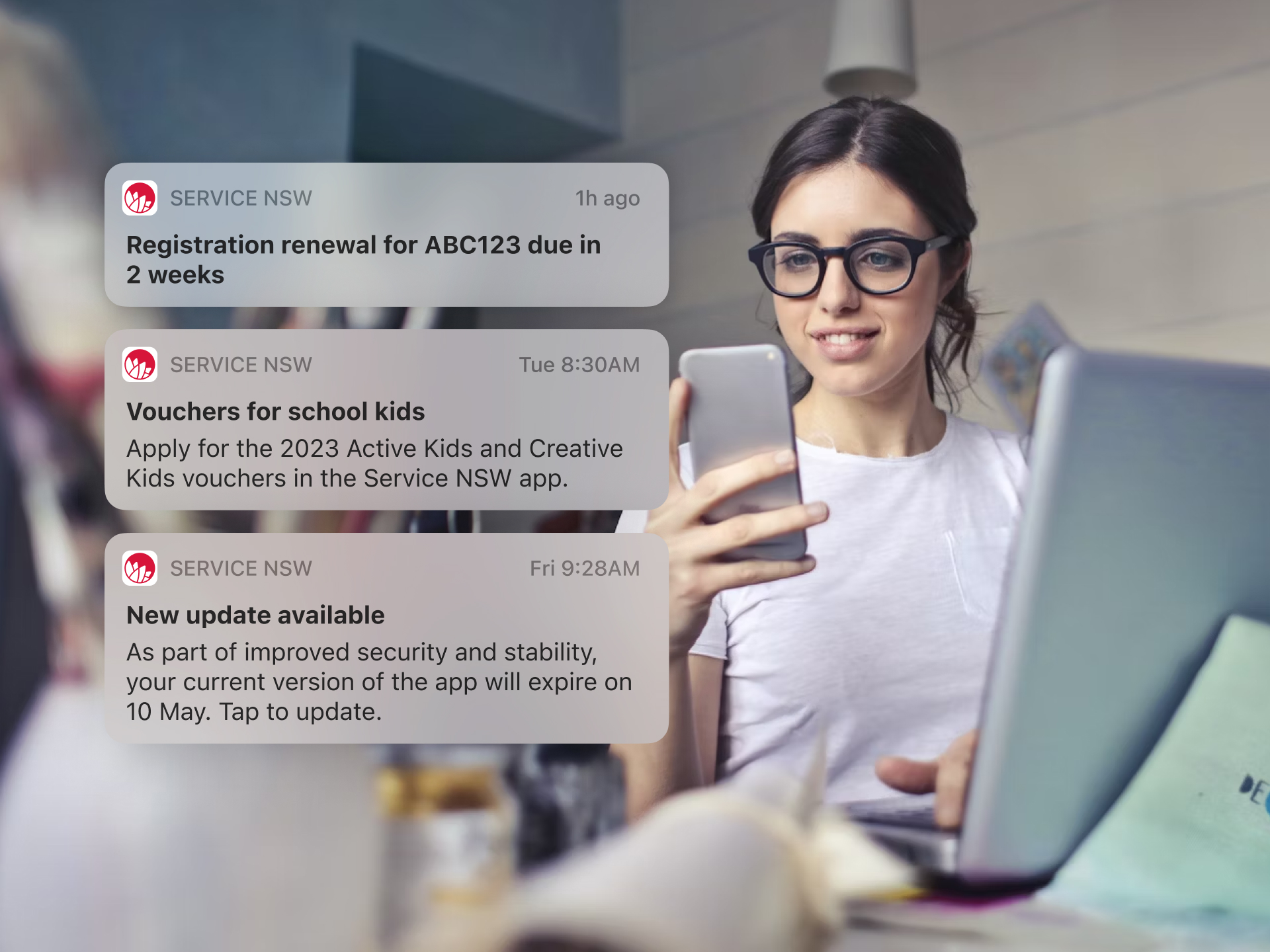
Customers were receiving inconsistent notifications and had little control over what they received.Notification senders lacked strategy, guidelines and tools to confidently send effective notifications.
Solution
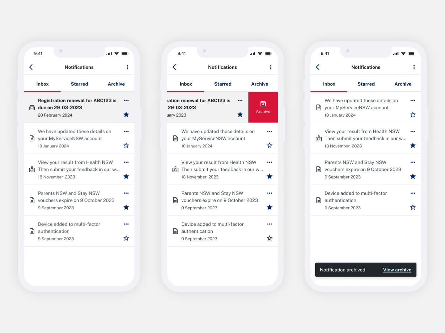
I led a redesign of the inbox and preferences to give customers more control and visibility of their important notifications. This made it easier for customers to know when their vehicle registration was due, or when they were eligible for new benefits.
I created guidelines and templates to help senders craft more effective, consistent and meaningful notifications.
🚀 Impact
400K+
customers opt-ins for digital vehicle registration reminders
customers opt-ins for digital vehicle registration reminders
400% increase
in opt-ins and $0.5m saved annually
in opt-ins and $0.5m saved annually
35% increase
in inbox usage
in inbox usage
130K
archive events
archive events
96%
customer satisfaction
customer satisfaction
Process
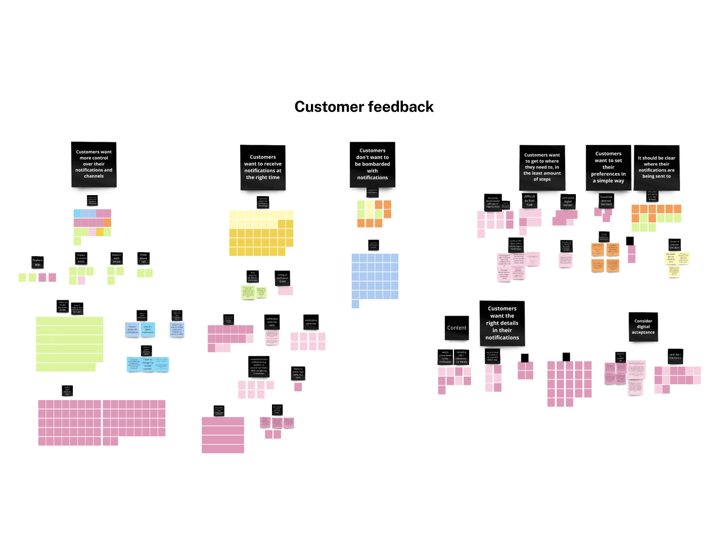
Notifications can be a useful tool for customers to be informed, to engage or to take action. After remaining untouched for some time we saw an opportunity to improve how Notifications could be delivered to millions of NSW residents from the Service NSW app.To understand more about the customer and their current issues, we completed an audit of the last 4 years of existing research and customer feedback.
We also needed to align closely with stakeholders in the notifications team and external agencies. We conducted multiple collaborative workshops to learn about their systems, needs and pain points.
For customers, we found:
- we had a limited understanding of their behaviours and needs
- customers couldn’t easily manage or opt-in to notifications
- customers wanted control and clarity around where they would receive notifications
- they wanted to receive relevant and timely notifications
For senders, we found:
- a lack of an overall strategy or guidelines, leading to inconsistent experiences for customers
- limited visibility of capabilities and processes
- difficult and time consuming sending process
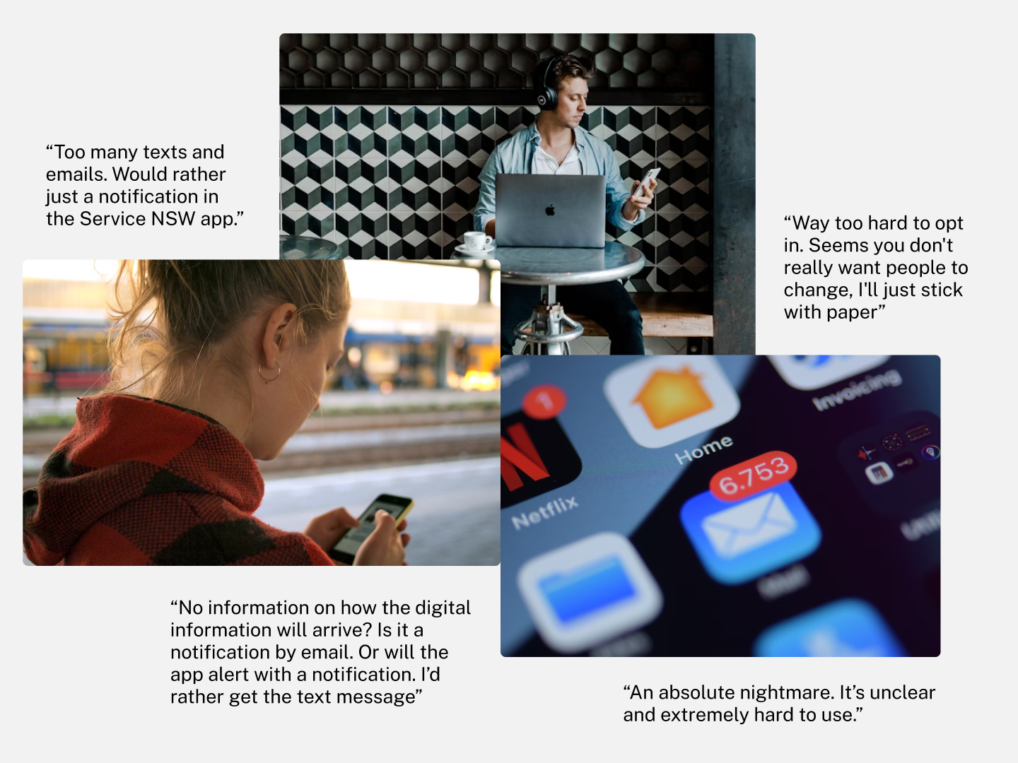
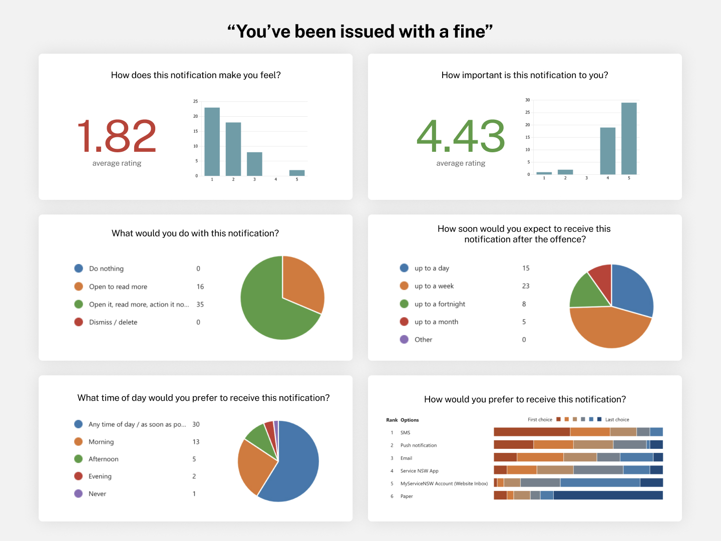
To gain a deeper understand our customers and their behaviours, feelings and perceptions on notifications, I led the development of two surveys with 100 participants.
We found:
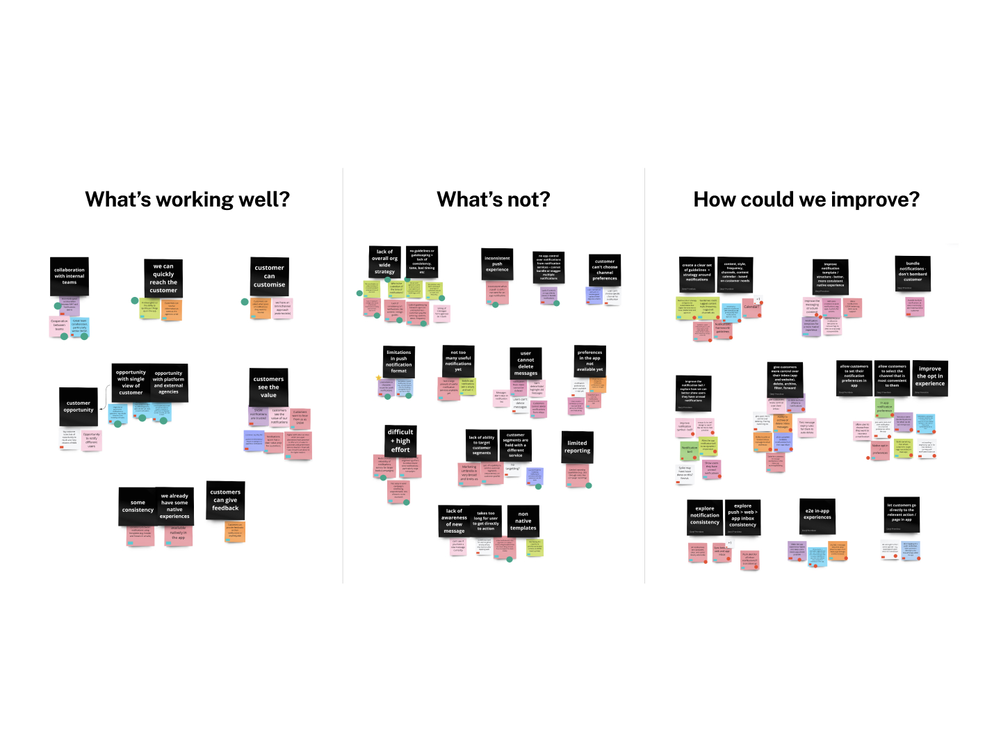
Through insights from our discovery and additional workshops, we defined 3 focus areas for ideation.
We found:
- customers preferred to be contacted by push and email, no more than once a week, as soon as possible
- the most important notifications were safety, time or money sensitive
- some of the most important notifications, evoked the most negative emotions
Through insights from our discovery and additional workshops, we defined 3 focus areas for ideation.
How might we empower customers to feel in control over what notifications they receive?
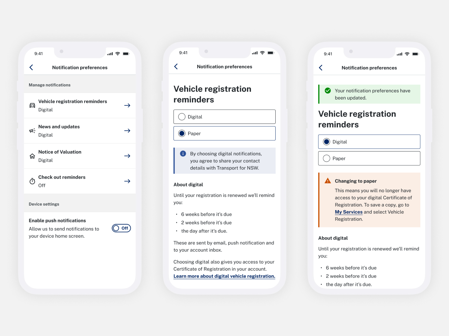
Customers had no way to manage their preferences in the app, so I led the design for a new native opt-in experience, and tested it with 6 participants.Research showed that customers wanted to know what notifications they would receive, where it would be sent to, and how often. They wanted granular and high level controls.
While we were unable to provide granular channel preferences due to technical limitations, our design was optimized for ease of use and transparency of information.
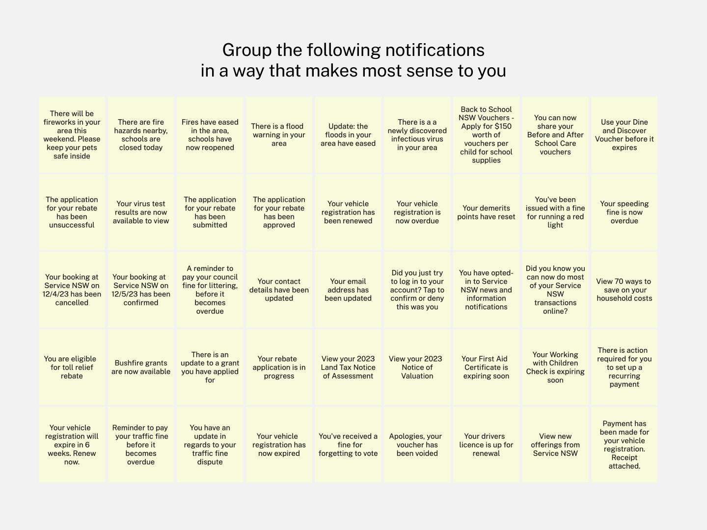
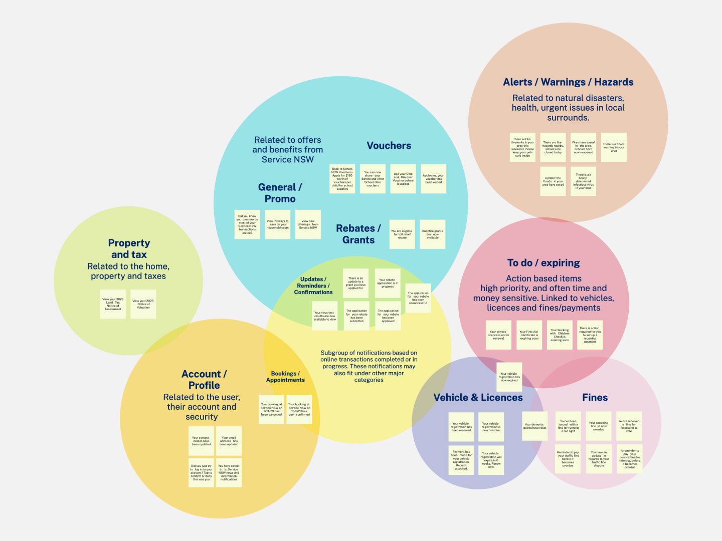
To better understand how customers categorise notifications and their mental models, I developed a card sorting activity (both moderated and unmoderated) with 15 participants
These insights were used to help define the opt-in notification types and a newly designed inbox.
- We found the majority of customers grouped notifications by urgency/importance/action or by theme/topic
- We gained better understand of what they do with notifications, how they triage and manage them
These insights were used to help define the opt-in notification types and a newly designed inbox.
How might we help customers feel informed, reassured and able to achieve their goals?
I led the design for a new inbox and tested this with 6 participants.Research showed that customers wanted more control over their inbox and to easily see what was important and required action.
Our design introduced new features like starring, filtering and archiving – giving customers more control and visibility over their important notifications.
How might we give customers a consistent and seamless notification experience across multiple channels?
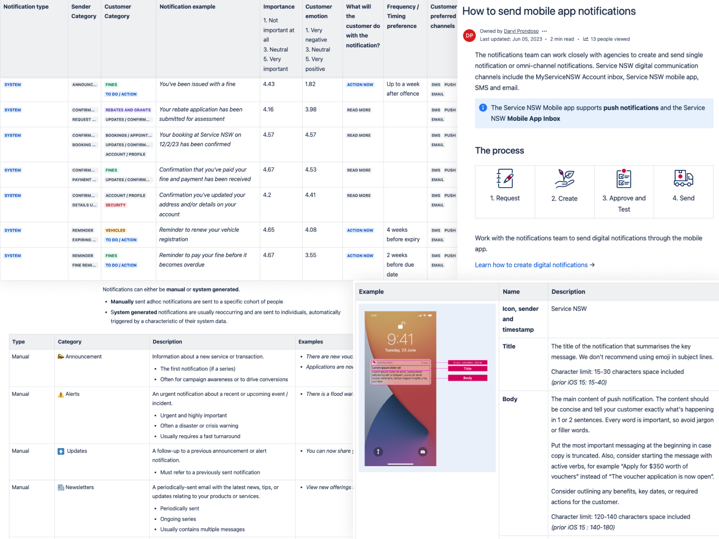
Senders needed guidance and information around how to send effective notifications through the app.
I developed an experience guide for notification senders. It included:
- processes on how to send
- notification structure and templates
- categorisation of notifications
- customer sentiment towards notifications
- content guidance
- technical capabilities
The introduction of this experience guide in conjunction with the notifications team, has helped move towards more consistent notifications, and simpler and more confident sending processes.
Increasing conversion, engagement and intention – Helping a crowdfunding platform smash their fundraising records
Role
Lead designer
Lead designer
Client
LaunchGood
LaunchGood
Completed at
Gould Studio
Gould Studio

Problem
Customers want to give charity conveniently and with intention during Ramadan.
They found the existing Ramadan Challenge unengaging and difficult to sign up to.
Solution
I led the redesign of the Ramadan Challenge, a seasonal product where users can donate to worthy causes over 30 days. I designed new pages and features to boost conversion, engagement and donations.
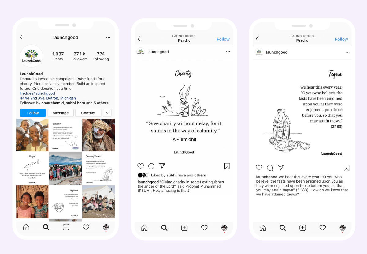
I crafted illustrations, social content and marketing material to increase awareness.


🚀 Ramadan 2020 Impact
$32M raised
2x increase from 2019
2x increase from 2019
250K signups
3.2x increase from 2019
3.2x increase from 2019
10% conversion
landing page
landing page
“[Gould Studio] transformed Ramadan on LaunchGood and raised it to a whole new level. I knew the team was talented, but I wasn’t expecting the depth of design thought and relentless passion to see LaunchGood maximize its potential this year, breaking all records on the site for fundraising.”
Chris Blauvelt, LaunchGood CEO
Process
LaunchGood is a crowdfunding platform that supports Muslims across the world through fundraising.I led a partnership with LaunchGood to help redefine their brand, vision, website user experience, design system, marketing campaigns and seasonal products such as the Ramadan Challenge.
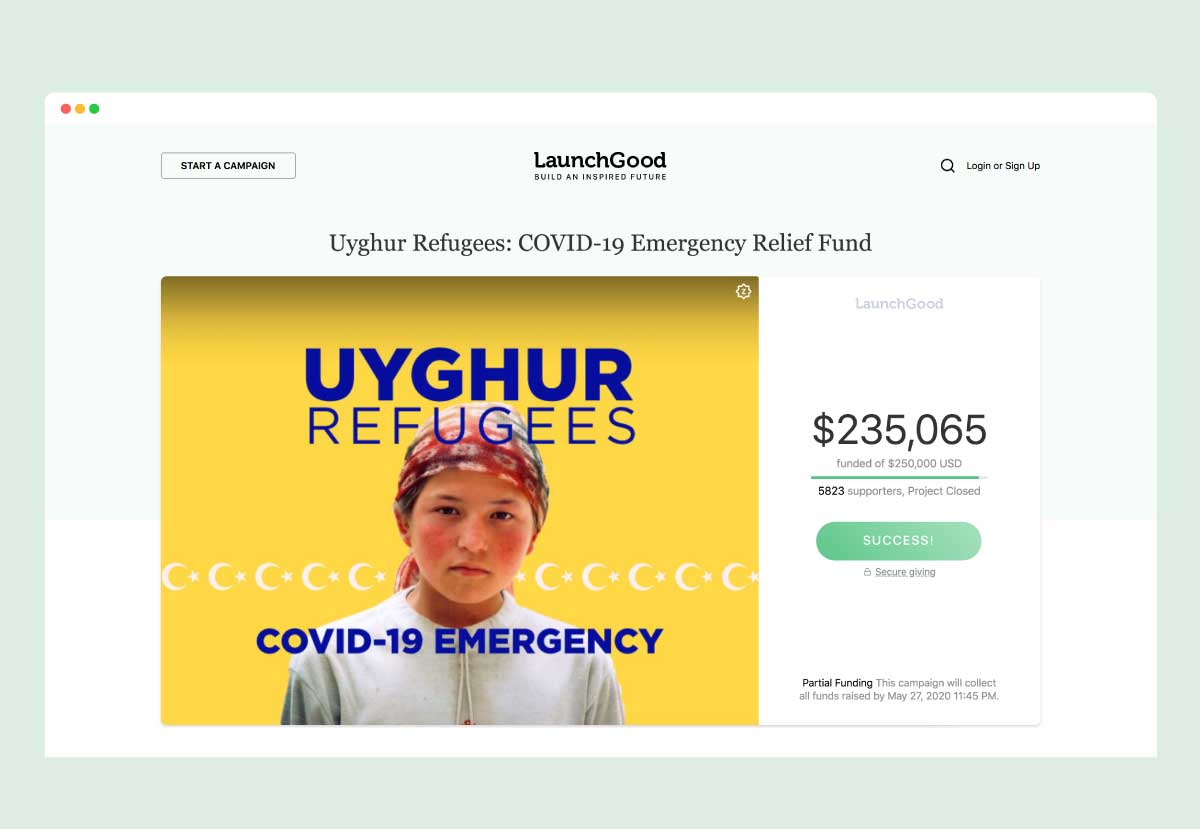
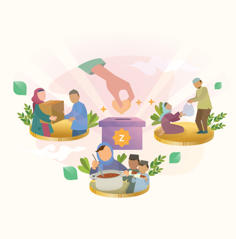
Ramadan is a special month in the Islamic calendar that involves fasting, prayer, community and charity. During this month, LaunchGood’s Ramadan Challenge allows customers donate to worthy causes over 30 days.
To improve the Ramadan Challenge product we immersed ourselves within the LaunchGood team and undertook a series of extensive strategic workshops, surveys and customer listening sessions to identify pain points and areas of focus.
We found that:
To improve the Ramadan Challenge product we immersed ourselves within the LaunchGood team and undertook a series of extensive strategic workshops, surveys and customer listening sessions to identify pain points and areas of focus.
We found that:
- customers want to donate conveniently and with intention
- the sign up process was confusing and hard to understand
- customers were frustrated that they could not select where their donations go
- there was low user engagement after signing up

How might we maximise signups, donations and fundraisers during Ramadan?
The sign up process was confusing and hard to understand for many. To improve this, I created new separate landing pages for customers and campaign creators.
I developed playful illustrations and optimised copy to ensure users easily understood how it works, and why they should sign up.

To improve sign ups, I created a conversational onboarding process. We simplified the payment steps and made it easier for customers to select higher donation amounts.

How might we bring excitement and increase engagement to the giving experience?
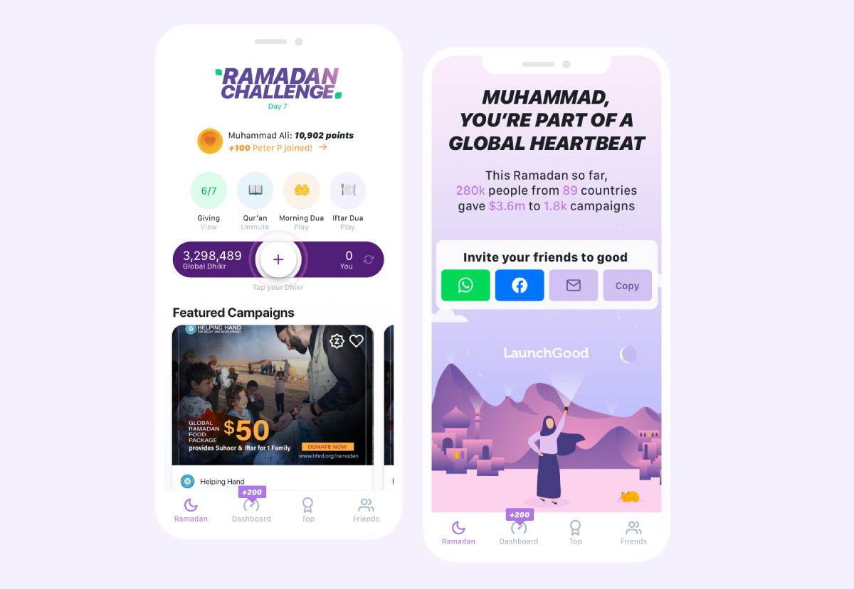
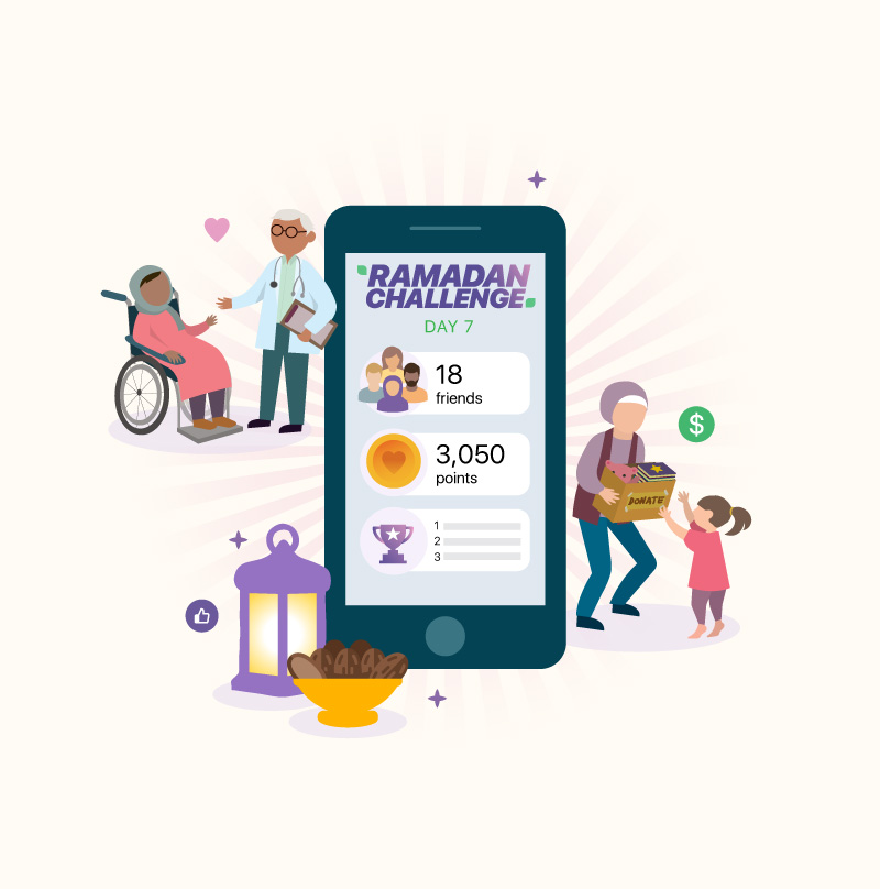
I designed a new challenge homepage, including rich daily interactive content to promote customer engagement.
To boost engagement and community spirit, we created a gamified “points” leaderboard, where users could gain points for shares, referrals, donations, creating fundraisers and other fun easter eggs. This increased shares, and led to more customer signups.
We created daily leaderboards for campaign creators, where campaigns with the most supporters or the most raised received prizes. The leaderboards and prizes helped boost engagement and donations.
We created daily leaderboards for campaign creators, where campaigns with the most supporters or the most raised received prizes. The leaderboards and prizes helped boost engagement and donations.
How might we bring intention to the giving experience?
Previously, when customers opted-in to automatic giving during Ramadan, they were not able to choose where their donations went.
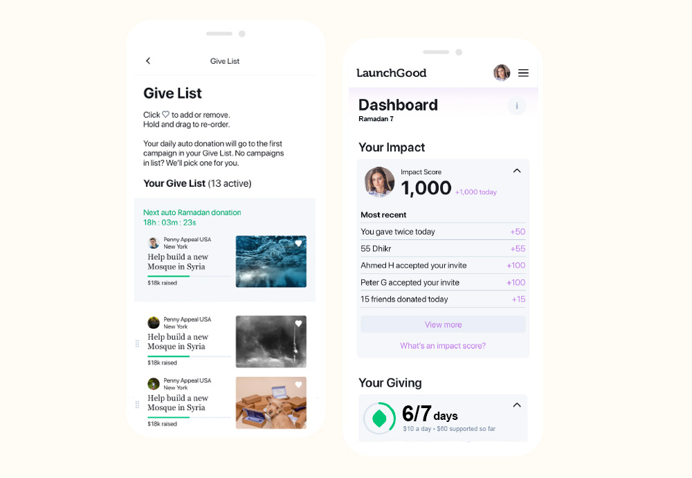
I designed a new feature called the ‘Give List’. Customers could add their favourite campaigns and automatically donate to campaigns in their list. This allowed customers to have the convenience of automatic giving, with the ability to give with intention.
I revamped the dashboard so customers could easily track and view their own impact and giving.
In addition to the UX, I created illustrations, content, animation, video and marketing campaigns to help boost engagement and awareness.
Supporting NSW residents affected by bushfires and natural disasters
Role
Lead product designer
Lead product designer
Client
Service NSW
Service NSW

Problem
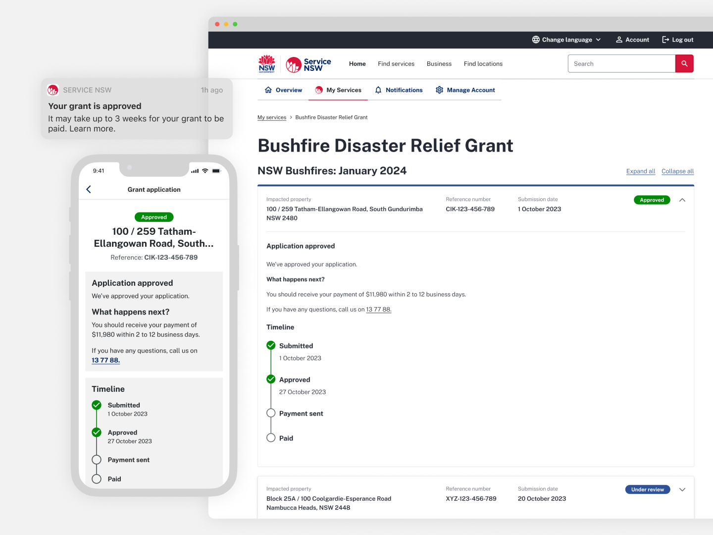
Customers are frustrated about not knowing the status of their grant applications, causing a significant load on call centers.
Solution
I also implemented an additional feature that provides customers helpful information and support when affected by a natural disaster.
Outcome
Working across multiple teams, we rapidly delivered a cross-channel MVP within 8 weeks.We were incredibly lucky that the bushfire season was not as predicted, meaning the feature was not published.
The product was designed with scalability and future disasters in mind, and was recently deployed in a matter of days for residents impacted by power outages and storms in Far West NSW.

Process
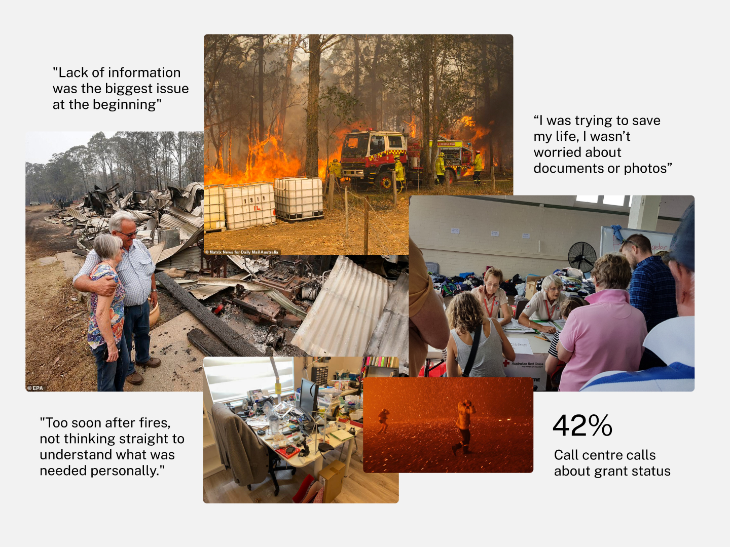
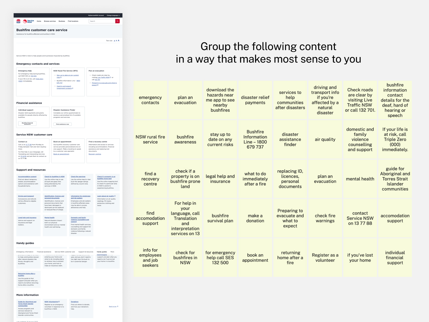
After countless bushfires, floods and ongoing effects of climate change, we wanted to proactively provide customers support through the Service NSW app when affected by natural disasters.An audit of existing research showed that:
-
Customers need quick, easy access to government services and support
-
Customers may be facing trauma
-
Some customers may not have access to home offices, laptops or documents
-
Internet and mobile connection can be patchy
- There can be lots of varying information coming from many different sources
How might we make it easier for customers to get financial support after a disaster?
Customers didn’t have a way to track their grant applications or know when funds would appear – causing a significant load on call centers.
We aimed to help support customers with the ability to apply for and track the status of grant applications.
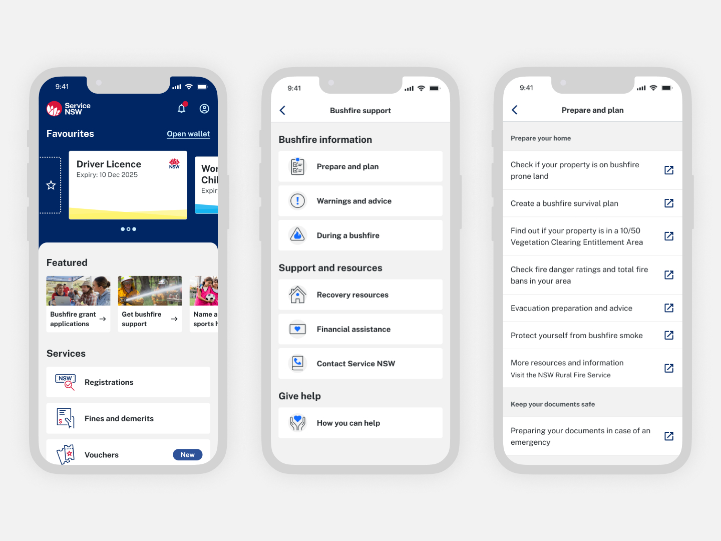
I led the design for disaster grant applications and statuses in the app.
To bring this to life, we participated in cross team ideation sessions and completed hallway and guerilla testing.
We worked closely with other internal teams (Customer Account and Grants and Rebates teams) to ensure that we delivered a seamless experience, no matter the channel.
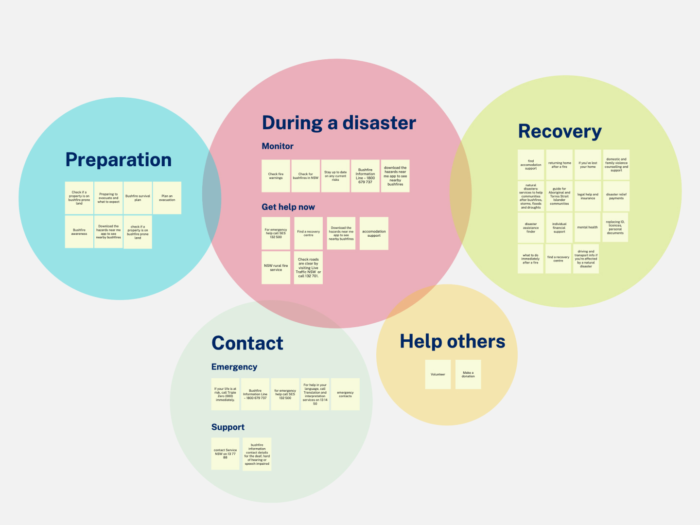
How might we support customers at all stages of a disaster?
We knew that during COVID, customers expected to find information and help from the government in the app. Leveraging this, we wanted to support customers during all stages of a natural disaster.
To understand the types of content that customers need during a disaster, we completed an audit of existing support content from across government. We conducted cross team workshops and card sorting activities to define how content should be grouped and displayed.
I led the design for a dynamic natural disaster support feature, that aggregates key information needed before, during and after a natural disaster.
Protecting the community during a global pandemic
Role
Product design co-lead
Product design co-lead
Client
Service NSW
Service NSW
Problem
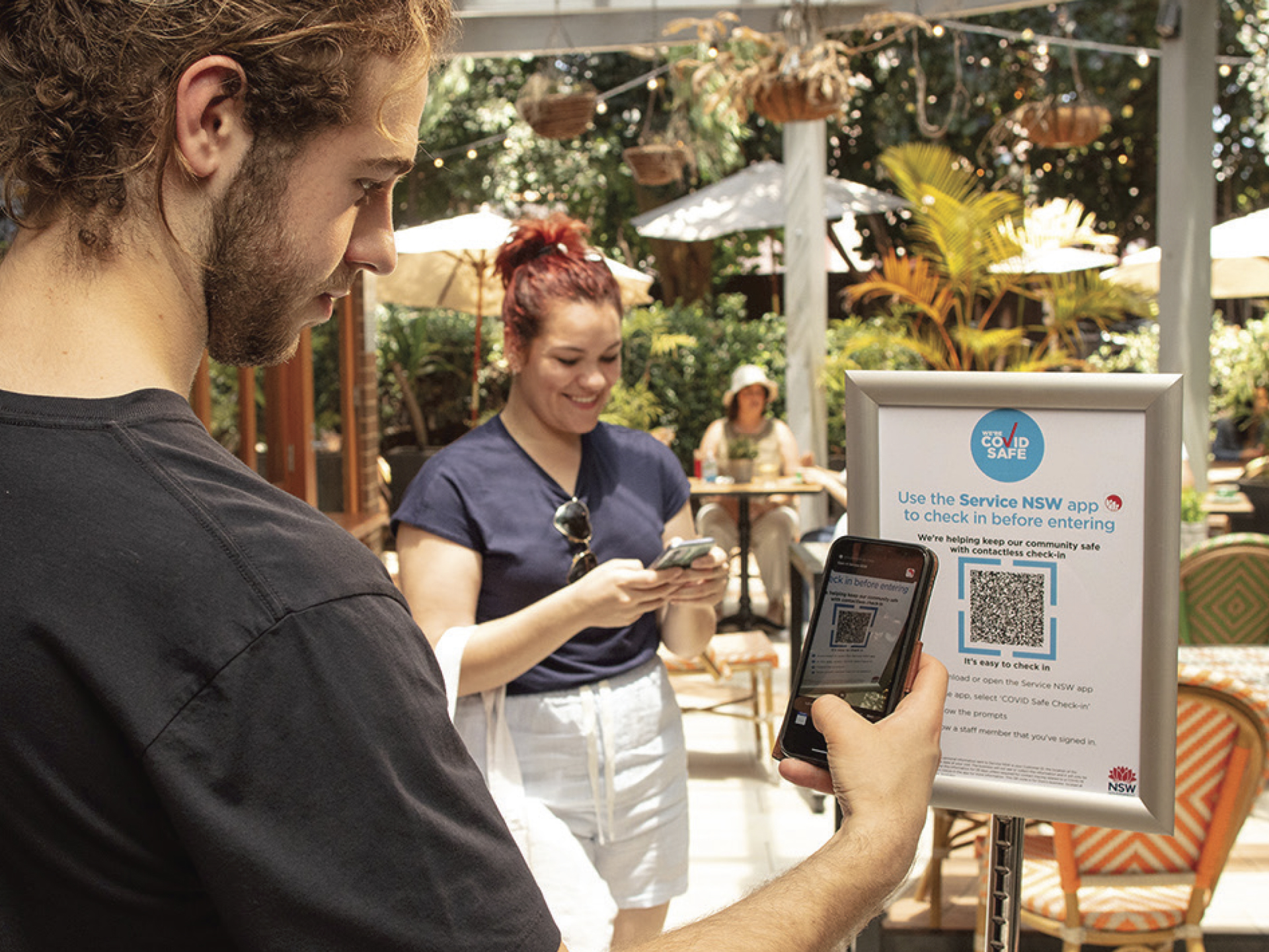
Customers needed a simple, safe and secure way to provide their contact details when entering venues for COVID contact tracing.Solutions
COVID Safe Check-in was introduced as a way to help keep the community safe. Customers could scan a QR code, and their information was securely captured by NSW Health.Leveraging customer feedback and data, I co-led a variety of enhancements for this product, including:
 Scaling and improving check-ins for the future
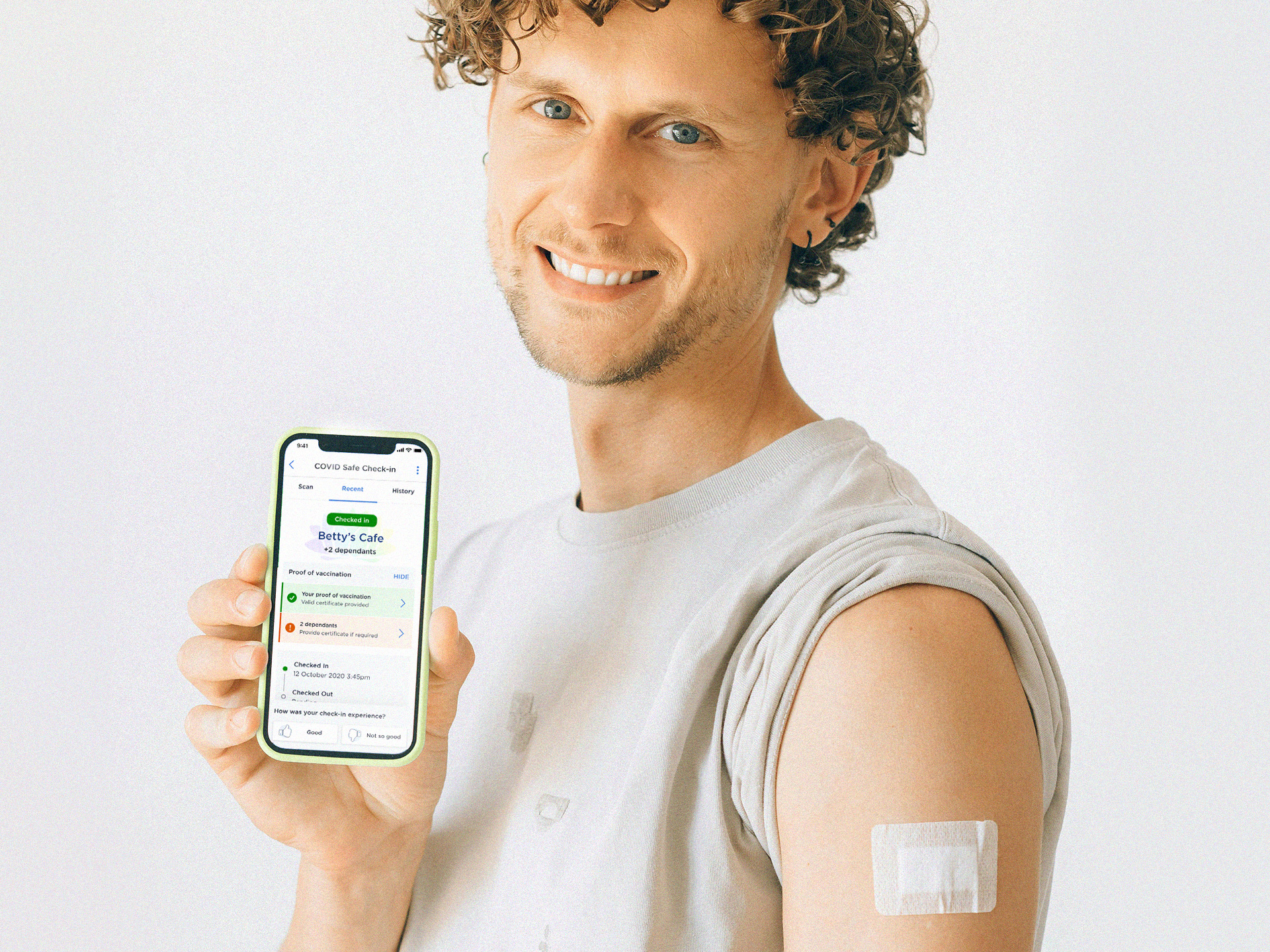 Helping customers prove their vaccination status
🚀 Impact
1.7+ billion
check-ins
check-ins
10.5M
users
users
2.5 million
linked vaccine certificates
linked vaccine certificates
94%
customer satisfaction
customer satisfaction
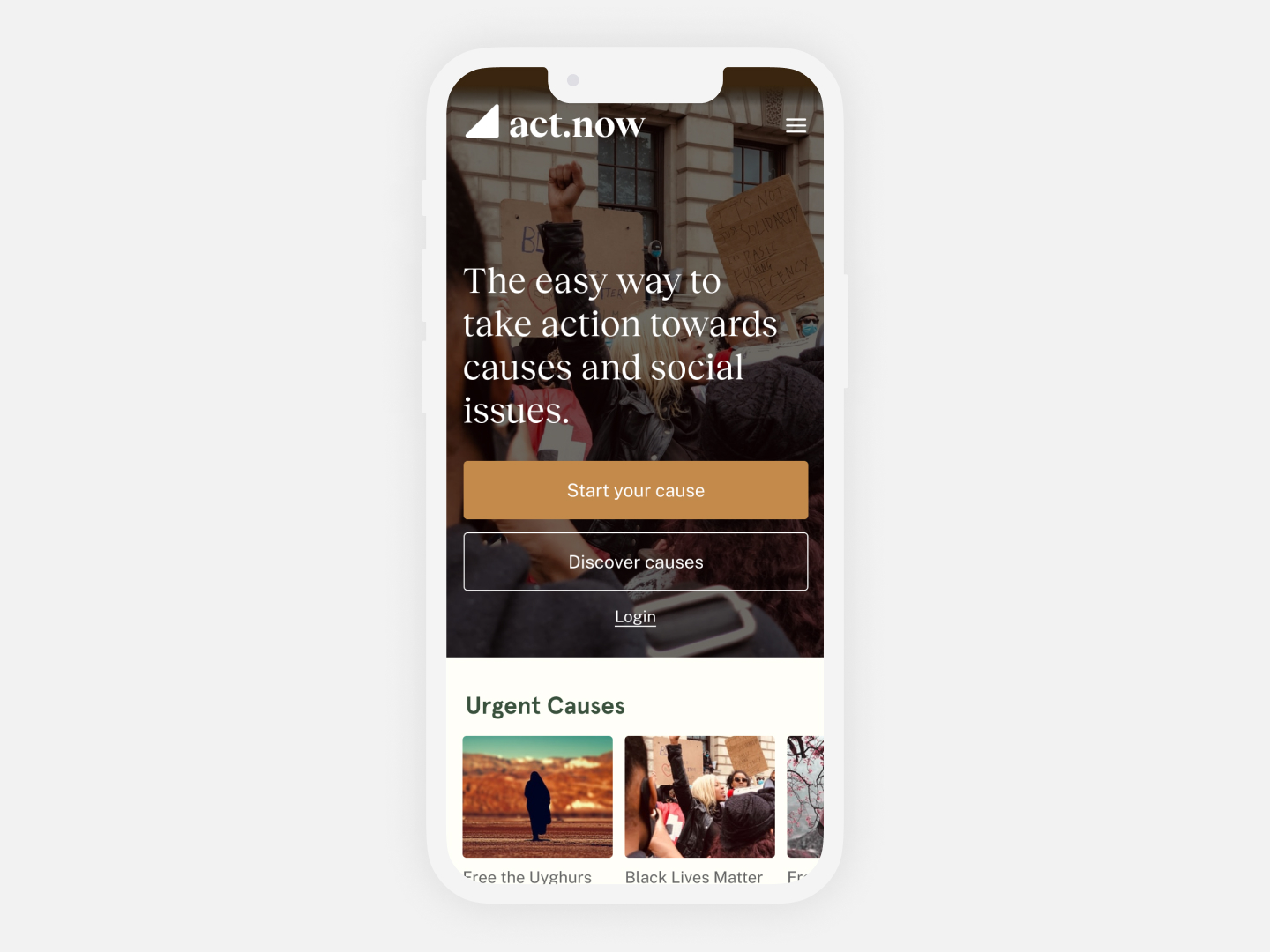
act.now
Making it easy to take action towards social issues
Role
Lead product designer
Founder
Lead product designer
Founder
Completed at
General Assembly
General Assembly
Problem
People feel overwhelmed with bad news and social issues — and can often feel powerless to help.Organisers can find it difficult to educate and engage people on complex issues and getting them to take direct action.
Solution
I designed a new platform to allow people to easily take action towards social issues, through bite sized verified information and direct calls to action.A project completed for the General Assembly User Experience course.
Process
This project came about based on my own experiences with social justice issues brought to light through social media. I wanted to explore ways to improve the experience for people who may feel overwhelmed, but want to do more than just like and share.I interviewed 8 people who shared some of their insights as people who either cared about social issues, or had experience in organising for causes.
This uncovered insights and themes around their passions, how they receive news, their feelings, actions and behaviours.
Customers wanted to be able to dig deep into information from verified sources in their own time. They wanted to be able to take easy actions.
Organisers wanted to make their causes simple to understand and and easy to engage with. They wanted to be able to consolidate information in one place.


How might we make it easier for people to directly engage with and take action towards causes and social issues?
The concept: A new microblogging platform that allows users to create and view causes, and take simple action towards them.
- Users can browse or create a page with bite sized information about a topic
- Each page contains direct calls to action (such as donate, write letter or sign petition)
- Links and verified resources are available to learn more
- Each page is optimised for engagement and sharing


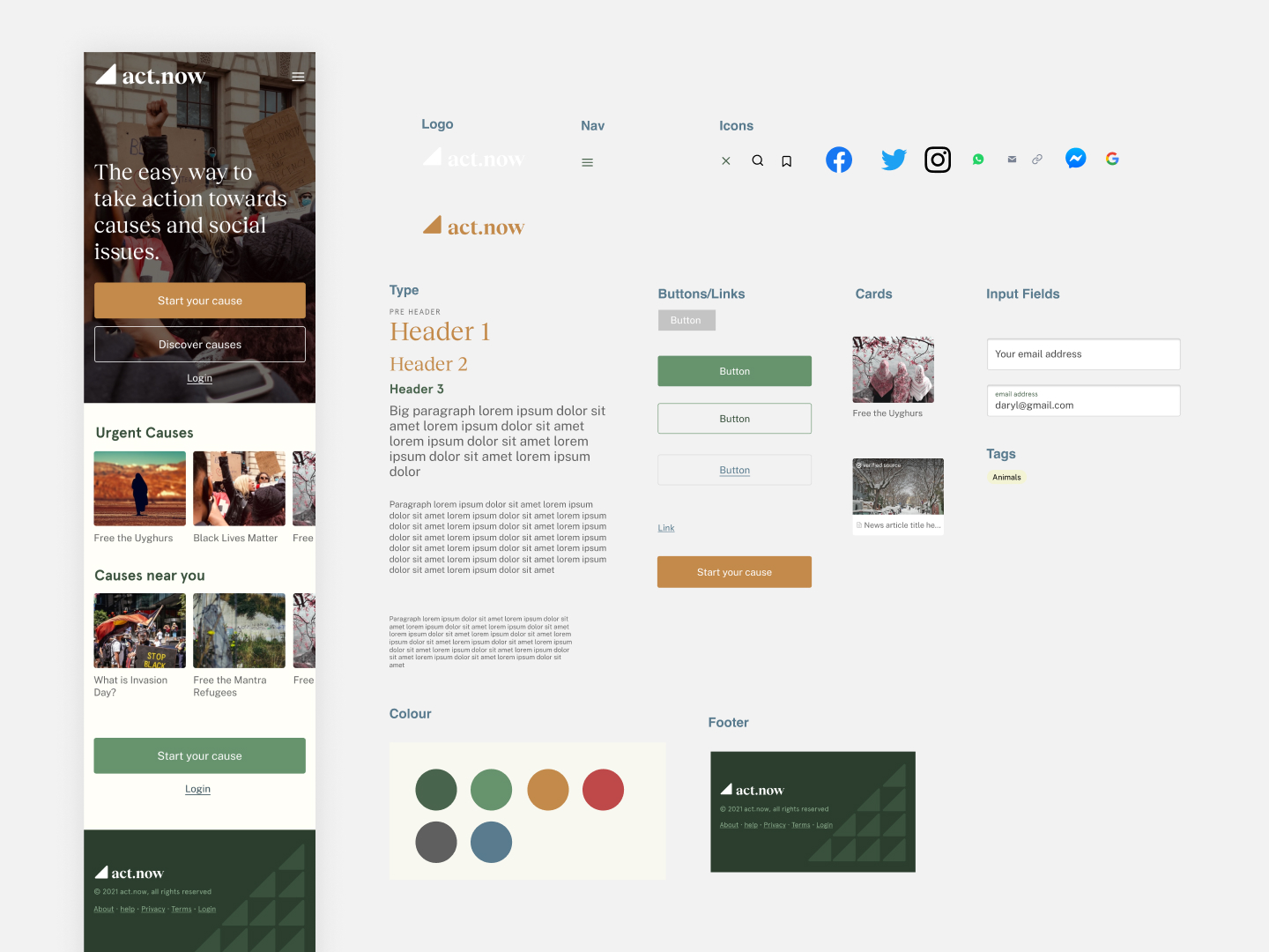
A design system and prototypes were created and tested with customers.
Customers found it simple to create causes, share and understand key actions. They found it difficult to discover new campaigns, save and keep track of important issues.
I iterated on the design based on this feedback and arrived at the final prototype.
Next steps
The project was well received by customers and General Assembly.
To continue this idea, I would like to:
Customers found it simple to create causes, share and understand key actions. They found it difficult to discover new campaigns, save and keep track of important issues.
I iterated on the design based on this feedback and arrived at the final prototype.
Next steps
The project was well received by customers and General Assembly.To continue this idea, I would like to:
-
conduct further user testing and research to uncover more insights
-
continue iterating, expanding on pages and functionality
- exploration the addition of key features, including more customisation features for Organisers, and more admin features like analytics and dashboards.


︎︎︎ More projects ︎ Next